
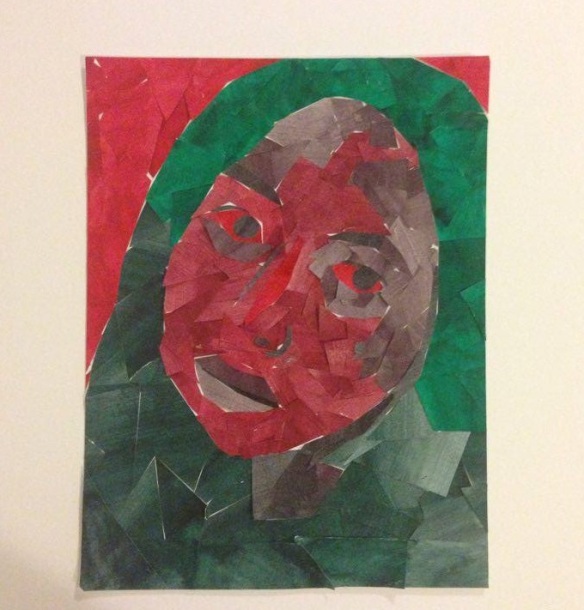
The colors I used for my complementary color scheme are red and green. Depth was created by the different use of the colors to create contrast. By doing this it is easier to identify the features of the selfie. The intensity if the colors allows for there to be balance between the two commentary colors. The successful aspects of the design is that commentary colors were used. The different variations of the colors allowed to piece to become somewhat successful. The unsuccessful aspect of the piece is that it could have been portrayed better.
